NZPOST 2024
Making Parcel Labels More Accurate & Transparent for My NZPost Business.

Credits
Solutionise to multi-faceted product UX challenge to protect business revenue and instruct customers by displaying improved transparency in service charges for Business shipping self-service platform.
Implementing a strategy that emphasises user-centred design, teamwork, and data-driven decision-making to address revenue loss and customer apprehension, offering benefits for both the company and users. Leading this
endeavour for the team, as a dedicated UX/UI designer for the platform.
$316K
Estimated benefit per annum
Project details
Product:
NZ Post Business Self-Service Platform
Duration: 3 months
Platform: Web
Team composition
Core Team:
UX/UI Designer (My Role)
Product Owner
Stakeholders:
Pricing Team
Legal Team
My contributions
Led UX/UI design
Validated requirements
Conducted user research
Created wireframes
NZ Post (Employer)
State-Owned-Enterprise in New Zealand in the postage and courier industry.
My NZPost Business
NZ Post has a digital squad maintaining MyNZPost Business, a self-service platform for small to medium size business owners often ship their products, with a volume of up to 50-100 parcels per week.
Key feature of the self-service product is to create a label to send a parcel. In this project.
My role/accountability
As a designer leading design part for MyNZPost Business, I was requested to enhance the accuracy of domestic label price preventing under-ticketing; entering smaller volumetric information of the parcel resulting in getting cheaper service fee options. Under-ticketing had created impact to the business losing the business revenue that is rightfully deserved.
Collaboration
Stakeholder from the pricing team and legal team for business compliance. Product Owner from the squad to discuss available development resource and timeframe.
Close collaboration with various teams

Identifying problems
NZ Post pricing team noticed that we are losing 316K of business revenue annually. When communicating with stakeholder, the conversation often goes into the solution stage before getting comprehension about the situation. This case was one of those cases hence I got back to the stakeholder and asked following questions to understand what he wanted to explain to the squad. Deciphering others expressions for business decision excites me.
I analysed data provided by our Product Owner, revealing potential revenue increases by addressing this issue. We then examined the current service creation journey to understand customer behaviours.
Label creation journey with fee correction for domestic parcel

User research and hypohthesis
Based on the journey map above, I came up with a few hypothesis;
User has different preferences on frequency of notification by occasion and media.
Current invoice is not clear enough to understand the additional charge.
Also, I surveyed which touch point need improvements. From our super user pool, we contacted 7 customers to view simple wireframes and answer scenario-based questions on Maze.
Throughout the online survey, I've gained customers behavioural insights as below;
Customers show different channel preferences based on payment context
Higher preference for official channels (website) for initial transactions
Strong preference for direct communication (email) for additional charges
The shift suggests customers want more immediate, personal notification for unexpected charges
Email content was not succinct.
Users wants enhancements on Payment History page for tax filing.
Tasks
Objectives: Clarity, trust, and accuracy
Implement dual notification strategy:
Maintain website as primary platform for initial payments
Use email as primary channel for additional charge notifications
Consider developing an integrated notification system that combines both channels
Eliminate the fractions of user experience across touch points:
Clarify copy writing in the email notification
UI update on the payment history page
Preventing issues at the source
We revised the label creation journey, focusing on the package information step by adding a clear, non-intrusive banner explaining the importance of accurate information to prevent experiencing unexpected additional charges.
Final UI design and copy writing

External link from the self-service platform to the Terms and Conditions page in public

Reimagining the invoice
Clarity meets compliance
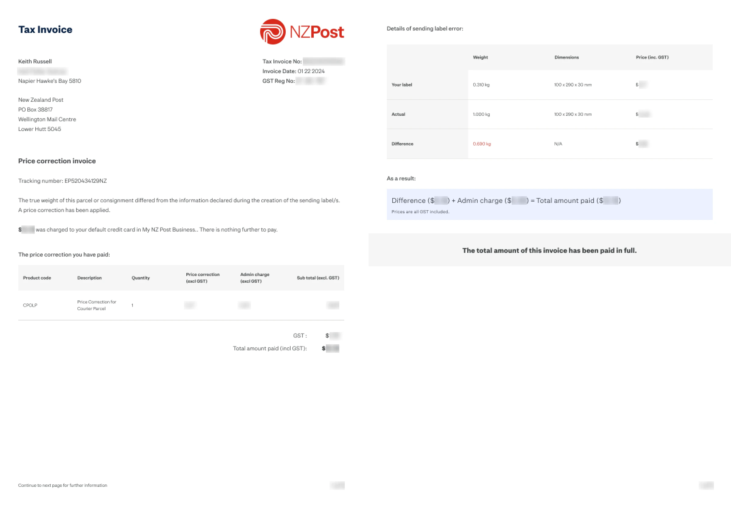
We have developed a new invoice template that effectively clarifies any discrepancies and subsequent charges. Invoices play a crucial role for business owners when filing GST (Goods and Service Tax).
Final outcome of new invoice template

We used to use the same invoice template for both the initial payments and the service fee correction payment, causing confusion among customers. The table included unnecessary columns for the initial payment, leaving customers puzzled about the correction fee in an invoice related to the shipping label creation process. To address this, I proposed creating a separate invoice template specifically for service fee corrections.
Starting with storytelling
I began by outlining the narrative that explains my intentions and communication goals.
Simplified table for initial invoice

Communication flow for price correction invoice

Visualise the story
Afterwards, I transformed the idea into a visual representation. I suggested a 2-page layout utilising the existing code base and creating a visual break between what has been additionally paid and why it has happened.
Introduce new invoice template
Improvements
Throughout several discussions and feedback from stakeholders, the ultimate design choice is a one-page layout to create a more concise and compact design.
Communication flow for price correction invoice
Notifying customers effectively
Keeping them informed
We created an email notification system to promptly inform customers about any unexpected charges in a calm and informative manner. The message includes clear details about the charge and a link to the payment history page on the platform. Within the timeframe, we focused on email template in this iternation.
Email notification content redesign

Beyond requirements
From the user research, I discovered that we would achieve holistic user experience with these design solutions;
Email notification should be sent out a month before the new policy takes effect.
A discreet toast banner appears when a new invoice is created for both first-time and extra payments.
Revamp the layout of the invoice list found on the Payment history page.
Suggested email content design

Suggested toast notification and position

UI redesign suggestion for Payment history page

Results
How could we evaluate this design?
This project didn’t roll out during my tenure; however, this design solution could be assessed using 2 metrics:
Monitoring the number of complaints received provides a straightforward method to assess customer feedback and identify any possible problems with the new system.
Implementing an NPS survey tailored to this change to gather quantitative data on customer satisfaction, along with the possibility of receiving qualitative feedback by including open-ended questions.
This implementation was not completed in my tenure, I can see some progress at the public level. As of Jan 2025, NZ Post announce this policy update that will commence Feb 2025.
Marketing email - Not part of my visual design

Reflection
I'm proud of the consolidated UX solutions from many different angles of the business. Despite of the limited resources in production, there are always opportunities to improve UX/UI design.
Understanding the users' point of view and business requirement enabled me to come up with proactive approach to discover and eliminate the hidden spots.
On the other side, it would have been better if the product could afford robust features rather than MVP solutions.


